
Logo Design colours – How to use the PANTONE® Colour Chart for your Logos
The PANTONE® Matching System (PMS) is a system shared world wide by the graphic arts industry, including logo design companies. You may view the PANTONE® colour chart on this page to help specify certain PMS numbers to use for your logo design, however you should note that because every computer monitor varies slightly in colour this PANTONE® colour chart is intended as a reference guide only. You should view an actual PMS colour swatch book or use current PANTONE® Colour Chart Publications for most accurate PMS colour match.
Tips and advice on choosing colours for your logo design
The first consideration is your budget. The more colours your logo has the higher your printing costs will be. It’s a good idea to keep your selection of colours to a maximum of three. Too many colours can also make it more difficult to effectively reproduce your logo as a quality looking professional graphic.
Another important aspect of your logo design colours that is often overlooked is the psychological connections that we have with colours and the different feelings and emotions they can evoke in us.
Colour choice should be carefully selected in consideration with your target market as interpretations of colours can vary depending on such factors as cultural demographics, age and gender.
Additionally, just as fashion follows trends are constantly changing, colours can be used similarly. For example it would be wise decision for a new, dynamic and vibrant company to follow the current trends. On the other hand it would probably be best for a long established traditional financial firm to stay with a more conservative colour set that has, and will continue to, work well for their company over a long period of time.
There are, however, some basic rules of thumb. Certain colours complement each other, and others ones don’t. When using colours as text, black text on white backgrounds may be dull but numerous studies have proven time and again that it is the most readable and pleasing to the human eye.
Conversely yellow text on white background is not only unreadable, but causes eye-strain which will quickly leave your potential clients with a poor impression of your logo and business. Nothing will lose sales faster than eye-straining text.
We invite you to have a look at our Logo Design portfolio to see how we have used colours in other logos that we have created. There are many examples in our portfolio to help assist you with your own ideas.
Typical psychological emotions colours arouse in people
Here is a list of some of the common colours we use and what type of psychological emotion they typically arouse in people. Use them wisely…
- RED is associated with love, passion, danger, warning, excitement, food, impulse, action, adventure.
- BLUE is associated with trustworthiness, success, seriousness, calmness, power, professionalism.
- GREEN is associated with money, nature, animals, health, healing, life, harmony.
- ORANGE is associated with comfort, creativity, celebration, fun, youth, and affordability.
- PURPLE is associated with royalty, justice, ambiguity, uncertainty, luxury, fantasy, dreams.
- WHITE is associated with innocence, purity, cleanliness, simplicity.
- YELLOW is associated with curiosity, playfulness, cheerfulness, amusement.
- PINK is associated with softness, sweetness, innocence, youthfulness, tenderness.
- BROWN is associated with earth, nature, tribal, primitive, simplicity.
- GREY is associated with neutrality, indifference, reserved.
- BLACK is associated with seriousness, darkness, mystery, secrecy.
PANTONE® Colour Chart & PMS Colour Matching Table
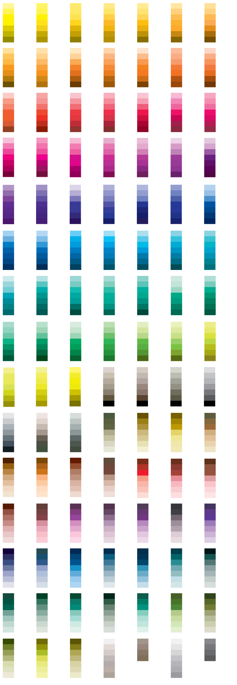
Please use the information on this page and the PANTONE® colour chart above as a guide when choosing colours for your logo and if you have any questions please contact us. It really comes down to your target audience and what psychological message you want to convey to them in colours. Blues and white work best for professional business logos. Maternity logos should consider some pink. Golf or lawn mowing logos should consider green. Adventure tourism logos should consider red, etc.